I was trying out the new preview for the Custom Field Edit component and it doesn’t look like it’s accessible. There’s no visible label and I can’t see any way to associate it with the pseudo-label that is the custom field name already on the page. There don’t seem to be any props exposed on the CustomFieldEdit component or on the Select component.
My Forge app is all about accessibility so I’ll have to keep using the popup modal dialog approach. It’s not great for accessibility either, but at least the field can be labelled.
Please ensure accessibility is covered (ideally before releasing things as Preview releases) as I know it is taken seriously by the Design System components.
With Select components, accessibility is covered with Label components that are associated with props on the Label components.
Thanks for the reply but this isn’t when working with Select and the Form components. This is when using Select and the new CustomFieldEdit component. The new CustomFieldEdit component doesn’t expose any props to connect the Select with the content on the issue (which is not even a label).
Funny story but I was on the dev team that created both the Select and Form components while I worked at Atlassian — I know both packages (at the Design System level) quite well 
Could I get a response on this please?
Hi @SeanCurtisHeapsGoodS,
would you mind sharing the manifest section of the custom field you’re talking about? That would help to check the issue you’re talking about.
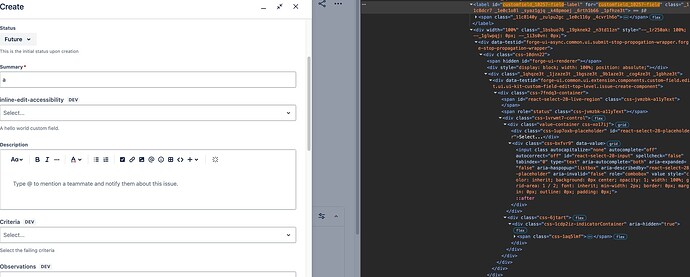
This shows the field and DOM for the Create (and Edit) screen. The field label isn’t associated correctly with the inputId (the prop exposed in @atlaskit/select) so the field doesn’t have an accessible name.
This shows the inline-edit state when focused, note there is a label but it’s confusing as there are 2 mentions of the word “Edit” on it (using aria-label is good, but the implementation is bad).
This screenshot shows the field when in edit mode. Note the lack of an aria-label in the panel on the right of the dev tools. This is because there’s neither a <label for="id-of-select-field"> or an aria-label attribute specified. The @atlaskit/select component has many props to help resolve this: either use the aria-label, or associate it with the text on the view issue page to the left of the field using aria-labelledby (see https://atlassian.design/components/select/code)
There’s a repo here with a reproducible example custom field that shows the problem.
This is super important because the old experience (editing in a modal) is showing a warning that it will be removed soon, however the only other alternative is both inaccessible, but also still in Preview. Please don’t ship an inaccessible replacement feature.
If you still want to use the modal experience, you can, by implementing the modal opening yourself.
The docs are not updated yet (as it still says the deadline is April)
This is what I do at the moment, but it has a big red banner at the top now saying it’ll go away and to use the new inline-edit instead.
The beauty of using Forge is that I don’t have to write so much code. I want to have the best user experience for my users, while also having the easiest code to maintain. Writing a heap of code to work around an incomplete component is a huge fail — accessibility should be part of definition of done for all components/apps, and don’t just add it after MVP as it’ll be too expensive to fix poorly designed interfaces.
If you add the isInline flag and open the modal yourself, the warning goes away.
That not a workaround, that’s just hiding the message. I’d prefer the accessibility issue get fixed 
I was on the team that built @atlaskit/select back in the day so I know it has the props to support what we need. Just need Forge to expose them for us to use.
This is becoming increasingly urgent. Please can someone reply with steps to resolve this accessibility failure? The EAA is in full effect now and there will be increasing scrutiny for all apps. There’s no workaround for us if the legacy modal approach is removed.


